 Logo Guide
It represents our commitment to innovation, precision, and protection.
The hexagonal emblem symbolizes structural strength and balance, while the dynamic lettering
reflects the brand's forward-driven spirit. Together, they express ULTRAFIT's identity as a
trusted leader in automotive protection.
The logo must not be altered under any circumstances.
Please follow the guidelines on this page when using the ULTRAFIT logo.
See how each brand color is applied to the ULTRAFIT logo.













Official logo files — always use these, never recreate the logo.
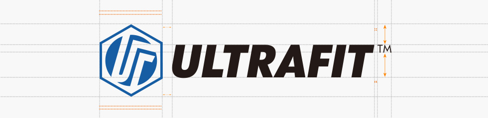
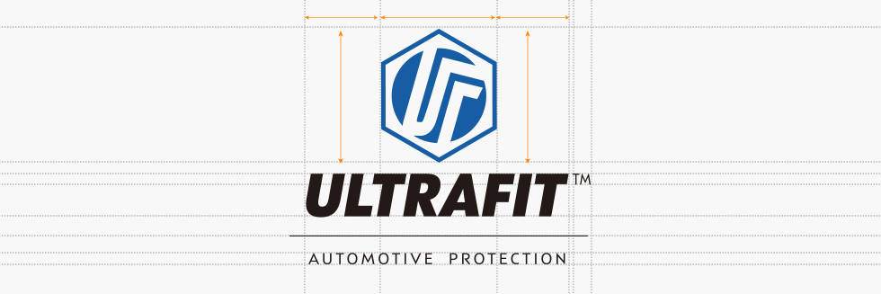
The designated clear space must be kept free of any graphic or text elements to uphold the integrity of the ULTRAFIT logo.
Never modify the logo. The following uses are prohibited:

Don't crop — always use clear space.

Don't offset.
Don't use strokes or outlines.

Don't use gradients.
Don't invert.

Don't use pattern fills.

Don't distort, skew, rotate or tilt.

Don't use alternative colors.

Don't place the logo on a photo background.
Don't distort — always resize proportionally.
To maintain the visual integrity of the ULTRAFIT brand, it is essential to use the logo exactly as provided. The logo has been carefully designed to represent our identity, and any unauthorized modification can dilute its impact. Users must strictly refrain from distorting, skewing, or stretching the logo. Never crowd the logo; always ensure there is sufficient clear space around it to maximize visibility and recognition. Stylistic alterations such as drop shadows, gradients, outlines, or special effects are strictly prohibited. Do not change the logo's color to unauthorized shades or place it on cluttered backgrounds that compromise legibility. The relationships between the elements are fixed and should never be rearranged or resized independently.
%20-%20SVG.svg)
%20-%20SVG.svg)